Mousse dessert with strawberries
Mousse dessert with strawberries – dessert recipe based on Philadelphia cheese with strawberries, covered with mirror glaze.

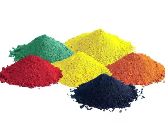
Food colorings are used in cooking for various reasons – for decoration, color standardization, or to compensate for color loss during heat treatment. Over the years in the kitchen, I’ve learned to distinguish natural pigments from synthetic ones not only by appearance but also by how they behave in dough or cream. Natural ones often have their own aroma and are less heat-resistant, while synthetic ones ensure precise shades but require careful dosing. It’s essential to understand that color is not just decoration but an element that shapes taste expectations. When I prepare a festive cake or jelly for children, I always ensure the colorings are safe and compatible with the main ingredients. Used wisely, they can become not only a means of decoration but also an expression of culinary artistry.
When selecting colorings, I always pay attention to composition and pigment source. Natural ones are derived from vegetables, fruits, or spices – beet juice, turmeric, spirulina. Synthetic ones are laboratory-made; although they have more stable color, not all can withstand high temperatures unchanged. In my practice, natural pigments perform well in cold desserts, while I usually color bright cake creams with gel colorings. It’s important to consider not only shade but also compatibility with fat, protein, or acids. For instance, spirulina green fades in acidic environments, and turmeric darkens with prolonged heating. I always test a new brand on a small portion of cream: if the color is even and doesn’t separate, the coloring is worth using. Equally important is to choose products labeled “food grade”, since decorative pigments for crafts are not edible. Reliable manufacturers indicate dosage and storage conditions, helping to avoid disappointment and off-flavors.
Diluting colorings is an art of its own. I always use clean tools to prevent unwanted reactions between pigment and residue from other ingredients. Powdered colorings are best dissolved in a drop of hot water or alcohol solution so the color spreads evenly in cream or glaze. Liquid and gel types should be added gradually, checking the shade after each addition. For a deep hue, I let the mixture sit for a few minutes – the tone develops more fully that way. In my experience, patience prevents mistakes: rushing often leads to color oversaturation. It’s especially important to be careful when working with meringues or whipped cream – too much liquid can thin them out. When coloring dough, I ensure the color doesn’t fade after baking; for this, I add a bit of lemon juice or vinegar to stabilize natural pigments. I remember once rushing with beet juice in macarons – after baking, the pink turned dull gray. Since then, I always test colorings under real baking temperatures.
Under heat, colorings behave differently, and this must be considered during recipe planning. Synthetic ones are generally stable, but above 180°C (356°F) they may shift in hue or lose brightness. Natural ones react even to short heating: beet red appears only in an acidic medium, otherwise turning brown. Over the years, I’ve learned to use this property to advantage – I add a little lemon juice to pastries to preserve color. It’s also essential to consider cookware type: metal containers can react with pigments, so I use glass or food-grade plastic. In the oven, colorings behave predictably only when the mixture is evenly blended; lumps cause blotches. For stable color, I recommend using gel or paste colorings – they are concentrated and don’t affect dough texture. When boiling jelly or syrup, add coloring at the end to retain vibrancy. When making glaze for a festive cake, I always cool the mixture to warm before adding color – this prevents pigment breakdown.
A coloring should not only decorate but also harmonize with flavor. I’ve often noticed how overly bright colors create false expectations: blue desserts seem minty, while red ones feel berry-flavored. That’s why I always align color with aroma. For citrus desserts, yellow and orange tones work best; for berry ones – pink and red; for nutty or creamy – pastel. In my practice, I use colorings not just for decoration but as a tool for setting mood. For example, gentle green in pistachio cream evokes freshness, while rich purple in blueberry mousse enhances flavor depth. But it’s important not to mix more than three colors at once – otherwise, the dish looks chaotic. Also, remember that serving temperature affects perception: cold dishes appear brighter than hot ones, so coloring should be adjusted accordingly. I always make a test batch, assess the color in daylight, and only then proceed with the full portion. This ensures a harmonious result where color complements aroma and texture.
The most common mistake is overdosing. Many believe more coloring means brighter results, but in fact, the excess alters taste and leaves a bitter or metallic aftertaste. In my practice, I always add color gradually, noting drop counts in a notebook to replicate results. The second mistake is ignoring lighting effects: under artificial light, colors look warmer, so dishes should be evaluated in natural light. The third is using expired or improperly stored colorings; they lose intensity and may cause sediment. I store mine in tightly sealed jars, away from sunlight and moisture. Another nuance is mixing precision. If the coloring isn’t fully dissolved, blotches can appear after baking. To check quality, I always cut a slice of the finished product – even color distribution is the best indicator. When working with natural pigments, it’s important to consider ingredient seasonality – in autumn, beets are darker; in spring, lighter, so shades may vary. Following these simple rules guarantees not only beautiful appearance but also consistent, reliable results every time.